In the vast manuscript 'A Voyce from the Watch Tower', the former regicide Edmund Ludlow left advice about what should happen to it after his death:
If the Lord please to put a period to my pilgrimage, before I have brought this
narrative to its perfection, it's my desier, that my deare wife, if liveing, if not, those
of my deare friends, and relations, into whose hands by providence it shall fall, will
take care that if it, or any part of it, bee thought of use unto others, it may not bee
made publique, before it hath ben perused, rectifyed, and amended by some one, or
more judicious friends, who have a fluent style, and of the same principle with
mee, as to civill, and spirituall governement, the liberty of men, and Christians, and
well acquainted with the transactions of the late times, to whome I give full power
to deface what hee, or they conceive to be superfluous, or impertinent, or what they
know to bee false, to change and alter what they find misplaced in respect of time,
or other circumstances, to adde what they conceive to bee deficient, or may conduce
to render it more usefull, and agreable, and to that end to cloth it with a more full,
and liquid stile, and to illustrate what is therein asserted with such reasons,
similes, examples, and testimonys, as they shall thinke fit. Provided that in the
maine, they make it speake noe other then my principle (which as I judge is
according to the minde of the Lord) in relation to the gouvernement of church, and
state, and Christ's ruleing... (Edmund Ludlow: A Voyce from the Watch Tower, ed. Blair
Worden. London, 1978, pp. 54-5).
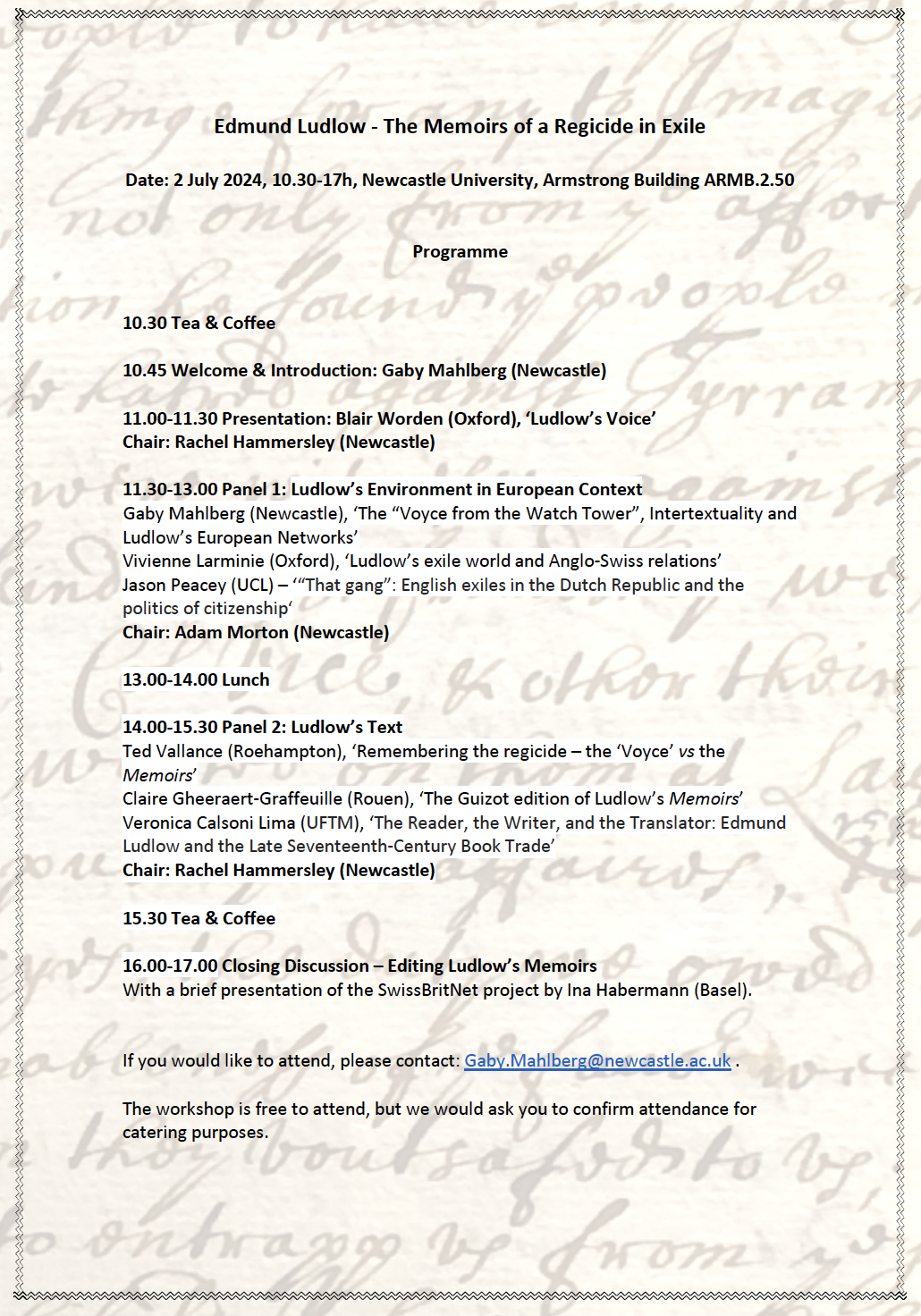
Ludlow's request that something be done with his manuscript was soon fulfilled. An edition, entitled The Memoirs of Edmund Ludlow, was published in 1698, one of several civil war-related tracts to be produced by John Toland and John Darby. It proved popular, going through at least four editions by the end of the eighteenth century and being translated into French and Dutch. Moreover, as Professor Blair Worden reminded us in his opening presentation at our workshop on 'Edmund Ludlow - The Memoirs of a Regicide in Exile', the text was used to teach generations of history undergraduates and future historians.
Yet Ludlow's other stipulations were ignored. This was revealed by Blair himself after he analysed the Ludlow manuscript, which was discovered at Warwick Castle in the 1970s, and compared it to the published version of the Memoirs. In the latter, Ludlow was, as Blair put it, 'taken to a literary barber'. The alterations changed the text from the work of a deeply committed protestant to that of an admirer of ancient republicanism.
In 1978 Blair produced an edition of the portion of the text covering the period 1660-62, which has remained a crucial source for historians ever since. He is, then, an editor of the text as well as an historian of the period. Given the complex history of the text, the role of editors was one key theme of our discussions.
The various editors of Ludlow's manuscript have exerted control over how Ludlow and his text have been understood by future generations. Yet the situation has been complicated by the fact that we only have the manuscript for the period 1660-77, both the later portion (covering 1677-85) and the earlier part - on the civil wars themselves - have been lost. In his paper, Ted Vallance paid particular attention to one important episode that is treated rather perfunctorily in the Memoirs, but which one might have expected Ludlow to dwell on more deeply - the regicide. The account of the trial and execution of Charles I in the Memoirs is very brief and, as Ted noted, this is at odds with later portions of the manuscript where Ludlow frequently returns to that event and expresses his views on it. Moreover, the account does not follow other known primary sources, raising the possibility that elements of it were invented.
Later editors and translators of the work were equally influential. As Claire Gheeraert-Graffeuille noted in her paper, the 1794 French edition of the Memoirs published as Histoire de la République d'Angleterre d'après les Mémoires d'Edmond Ludlow turned Ludlow into a French republican and his opponents, the Cavaliers, into French-style aristocrats. C. H. Firth, who produced an edition of the Memoirs in 1894, was equally influential in his insistence that the text accurately reflected Ludlow's views.
Edmund Ludlow by Giovanni Battista Cipriani, after Thomas Simon. National Portrait Gallery, NPG D28923. Reproduced under a creative commons licence. This is one of several images of Civil War figures commissioned by Thomas Hollis.
Of course, in some respects, these editors were simply doing their job in framing or shaping the text to suit their audience. This point was brought home to me by our discussions at the end of the day about the possibility of producing a new edition of the Ludlow manuscript. Our colleague (and experienced editor) Ruth Connolly insisted that our first step must be to establish what people currently read Ludlow for and what we think they ought to read him for. Our answers to these questions, she said, would dictate all our editorial decisions. Toland and Darby no doubt began by asking themselves the same questions and acting in the same manner. While we might argue that the invention of key passages took their actions beyond editing to rewriting, the question of exactly where that boundary lies is not clear.
In the past, the mid-century civil wars were generally seen as a purely English affair. When I was an undergraduate in the 1990s, even the notion that they should be understood in a wider British context was novel. Now, thanks to the work of various historians including Jonathan Scott and Gaby Mahlberg, the idea that the British civil wars should be viewed in a European - even a global - context is shaping and directing research. Analysis of the manuscript allows us to see Ludlow as a European - not just an English - figure. Exploring this wider European context constituted a second theme of our workshop.
Geneva in 1630. Image Rachel Hammersley.
Gaby's paper offered a sense of Ludlow's daily life in Switzerland: how he kept in touch with people in England and his knowledge of current affairs. She identified some of his key contacts in Switzerland including the Genevan politician and minister Charles Perrot, the chief minister of Bern, Johann Heinrich Hummel, and the Bernese politician Sigmund von Erlach. She also pointed out that Ludlow had religious contacts that stretched right across Europe. Vivienne Larminie's paper complemented Gaby's in deepening the exploration of the Swiss context and reinforcing the point that contacts between England and Switzerland were complex. For example, she showed that some of Ludlow's ties to Swiss figures came via his neighbours in Wiltshire the Earls of Pembroke and their involvement with the French Church in Westminster. Anglo-Swiss connections are being explored on a larger scale via the SwissBritNet project that Ina Habermann introduced to us at the end of the day.
In his paper, Jason Peacey, broadened our sense of the context beyond Switzerland to the wider Protestant world and, in particular, the Dutch Republic. His account of the experience of English exiles in the Netherlands shed light on the probable experience of those in Switzerland. Jason noted how the complexities of the Dutch system meant that the authorities were often more willing to offer help in capturing the regicides than to take concrete action. His paper also highlighted interesting (and topical) questions around the status of refugees in relation to their home country and country of residence.
Claire's paper addressed the European context from a different perspective in exploring the reception of Ludlow's Memoirs in nineteenth-century France. The historian and politician François Guizot included Ludlow's text in a series entitled Collection des Mémoires relatif à la Révolution d'Angleterre. These effectively acted as sources for his Histoire de la Révolution d'Angleterre (1826-7). Guizot's belief that these were valuable works to publish in French at this time tells us something about the place of the British revolutions within European history.
The third theme that was highlighted for me during the workshop was intertextuality. Gaby drew our attention to the Ludlow manuscript's status as a composite text. While published as a Memoir, it not only drew on Ludlow's own experiences and memories, but also on a range of sources including letters, newsletters (both manuscript and print), official documents (including Acts of Parliament and proclamations), and pamphlets (in English, French and Latin). While not all the sources are acknowledged, many are still visible within the text. This theme was deepened by Verônica Calsoni Lima, who concentrated on a set of pamphlets used not only in the manuscript but also in Ludlow's printed pamphlet on the regicides, Les Juges Jugez. Many of these were produced by a group of radical stationers in London which included Livewell Chapman, Thomas Brewster, and Giles Calvert. In this way the sources out of which the manuscript is woven tell us something not only about Ludlow's reading habits, and the sources of information available to him in Switzerland, but also about his networks and connections.
One of the first decisions we need to make if we are to produce a new edition of the Ludlow manuscript is whether it should be print or digital. Print is more durable as it is not at risk of obsolete technology rendering it inaccessible. Yet the potential offered by the digital is enticing. In a digital edition it would be possible to highlight the intertextuality of the text, perhaps even offering direct links to original sources. Visualisations of Ludlow's networks of European contacts, and the locations of editions and translations of the Memoirs, could be produced to accompany and contextualise the text. Of course, in producing a more interactive edition, and taking advantage of the possibilities provided by the latest digital technology, we would be transforming the text into something way beyond Ludlow's original vision and perhaps highlighting elements of it that he would have preferred to keep hidden. Would this, I wonder, make us as guilty of transgressing Ludlow's wishes as the editor of the Memoirs.
[Gaby Mahlberg has produced her own excellent report on the workshop, which can be read here.]


